One of the most intimidating aspects of a big project is figuring out where to start. Setting up your app or your team for success is where great design comes in.
Design can be many things, but in this repo, design refers to how you will systematically create a skeleton for your app that lets everyone involved from conception to publication stay on the same page.
Good app design will ensure that engineers across the entire stack will have direction for a project before it begins. At the end of this repo, you will know how to create detailed wireframes and concepts that establish user and data flow. We will be using the increasingly popular tool Figma as it is currently the class leader in collaborative editing. Think about Figma like the Google docs for app design.
In this section, you will learn how to create your first Figma document.
To create an account, head to the Figma website and follow the instructions after the sign-up button on the top-right. Once you are in your documents view, you can hit the plus button at the top left to create a new document.
If you wish, you may also download the Figma desktop app for MacOS.
In this section, you will be designing a mobile version of a desktop site.
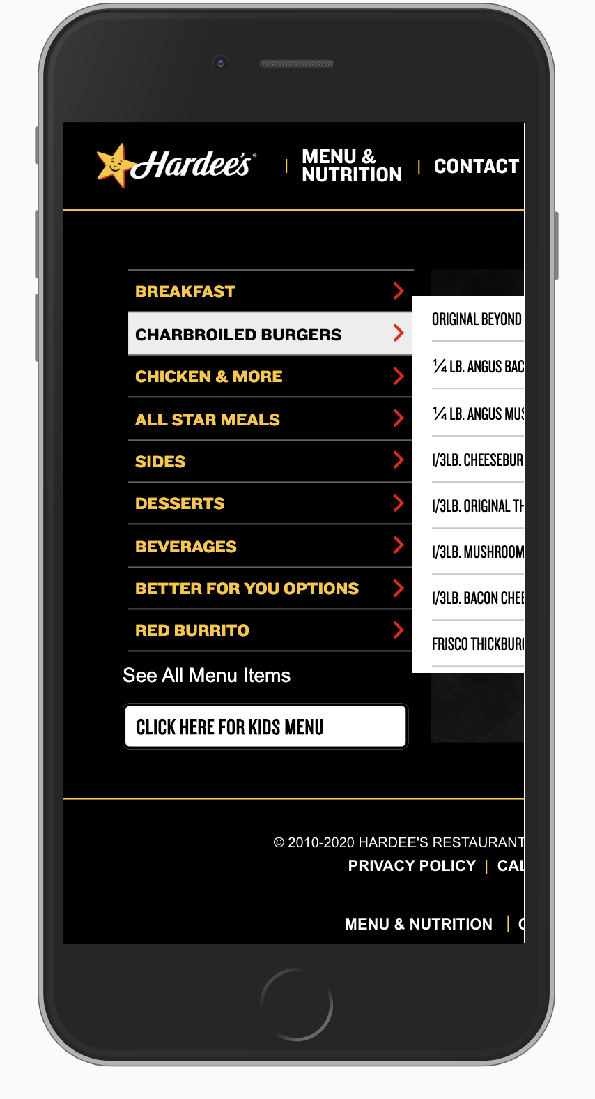
Specifically, we'll be mocking up Hardee's burger menu. Consistently ranked as one of the worst mobile websites, the page is begging for some help with a re-design -link. Go ahead and navigate to the page now, and use your developer tools to simulate the mobile view. You'll get something like this:
Your task is to mock up the "Menu and Nutrition" view, re-designing it so that the user has access to all the same information, but in a mobile friendly format.
It's important to start from the user's perspective. Although it may be tempting to jump in and simply reorganize content from desktop to mobile form, a much better experience will be had when you first consider what information is most relevant for the user first.
Before you begin, take a minute to think about what visitors to the menu page might expect. Here are some questions to consider:
- What information should be displayed on the page?
- How can I organize the menu most effectively?
- What information should be available first? Hidden in a menu?
Once you've answered these questions, you can begin to formulate user stories. These are questions that frame design and development from the point of view of the user, they generally start with "As a user...". Here are two examples to start you off:
- As a user, I should be able to navigate the menu easily to quickly find a burger's info.
- As a user, I should be able to easily see the ingredients on a specific burger.
Come up with 2-3 more user stories that you think a visitor on the menu page might go through. Consider when they might be visiting the page, why they might want to look for information and what information is most relevant to them.
Go ahead and rank your user stories in order of what you believe is highest priority.
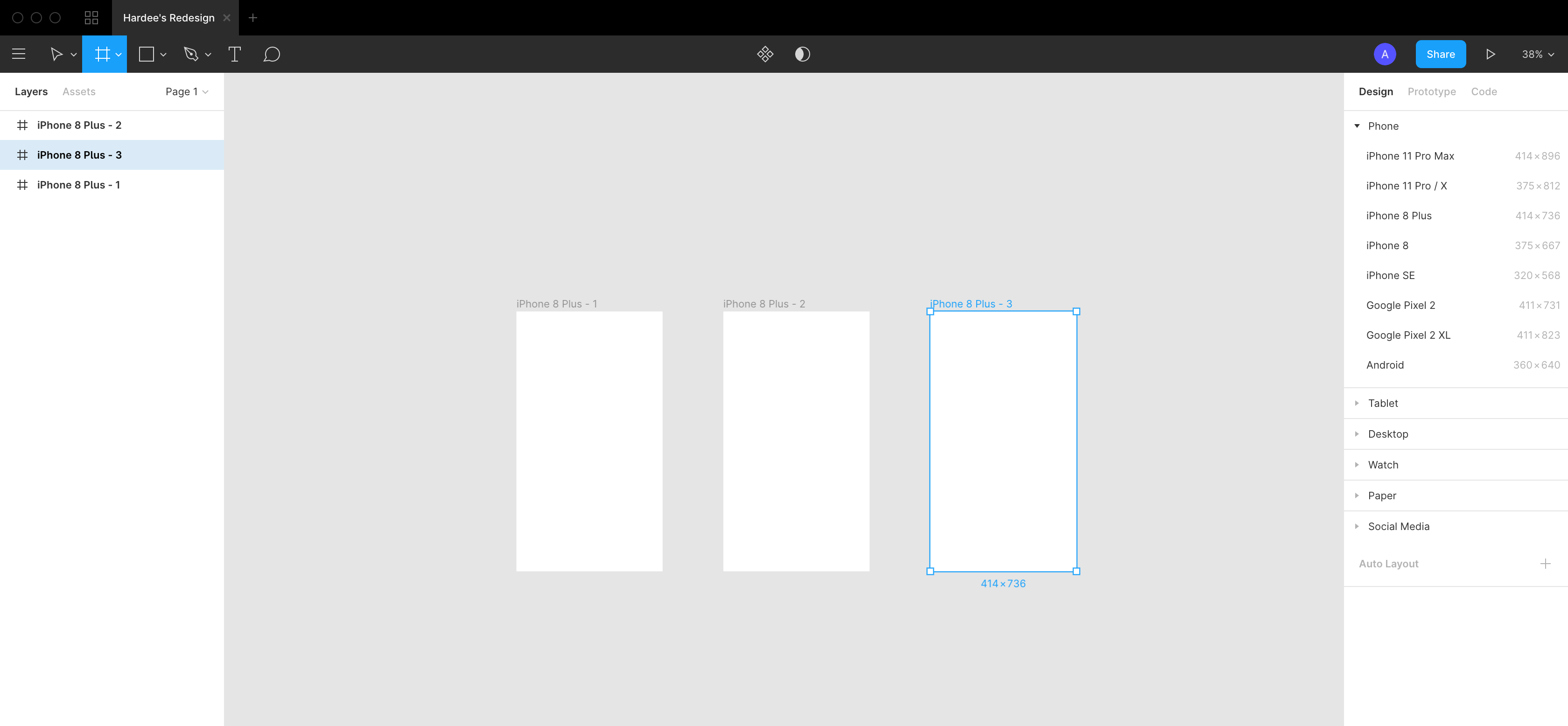
Now we can begin our mockup. As this is a mobile mockup, the first step we take is to decide which screen-size we are mocking up for. Generally it doesn't matter which device model you use for your mockup, but industry standard is usually the latest Apple device (with or without notch, up to you). There are two main reasons for this- firstly as Apple has a large market share of devices, and because it helps standardize the design process.
- Click the Region Tools (looks like a hashtag at the top left of the toolbar)
- On the right toolbar, under the design tab select a phone model. It should appear on your board.
- Put a name on top of it using the text tool, drag both items somewhere on the board you are happy with, and then lock the screen in place by clicking the lock button on the left in the layers menu. This prevents accidental moving of the frame.
You should have something that looks like this:
Congratulations! You've made your first app screen. One important caveat to note about mobile design: it may seem limited at first like you have little room to work with, but we've designed mobile websites to scroll. If you ever need to add more content to a mobile page later, you can do so and represent it in your mock-ups by making the frame longer (increasing the height).
Some will say that all art is just theft and for the most part that can be said about design too. There's no need to re-design an app from scratch with so many templates out in the wild. Often these starter templates can contain everything from components to font hierarchies (ie h1 vs h4) as well as different stylings. There will be many times in your career where you'll be asked to quickly design a mock-up, and using templates is often the quickest way to do so.
Here are some free starter Figma templates that you should save to your account. You will most likely be lifting components from some of them as we progress:
- Grommet: A popular component library that Netflix is based off
- Material UI and Material UI Icons: Based on Google's popular design language.
- There are several kits based on Apple's design language, feel free to Google one that works for you, but they do often tend to involve a fee.
Go ahead and use these templates (or not, if you want to do everything from scratch) to illustrate the following screens. Create a new frame like we did above for each screen.
- Menu navigation screen(s)
- You can have one for each menu sub-section, or one screen for all burgers. Think of which would be better for users.
- An individual burger view that displays it's ingredients and nutritional information.
As you do this, pay attention to design. Don't be afraid to lift assets from the Hardee's website and copy or find font and color equivalents. This is a crucial step to getting stakeholders to buy in to proposals.
This section details how to detail how to outline how data will be passed from one app screen to the next. Take a moment and think about why that might be important.
Here are some reasons why illustrating data flow is crucial to keeping everyone on the team on the same page:
- The back-end team will know what routes to create.
- The front-end team will know exactly what data they will have access to.
- If props are passed from component to component, they can be outlined here.
- If third party APIs are involved, they can also be mapped.
There are many ways to illustrate data flow, but as the Hack Reactor curriculum is React based, we will treat data passed between screens as props and represent them as objects.
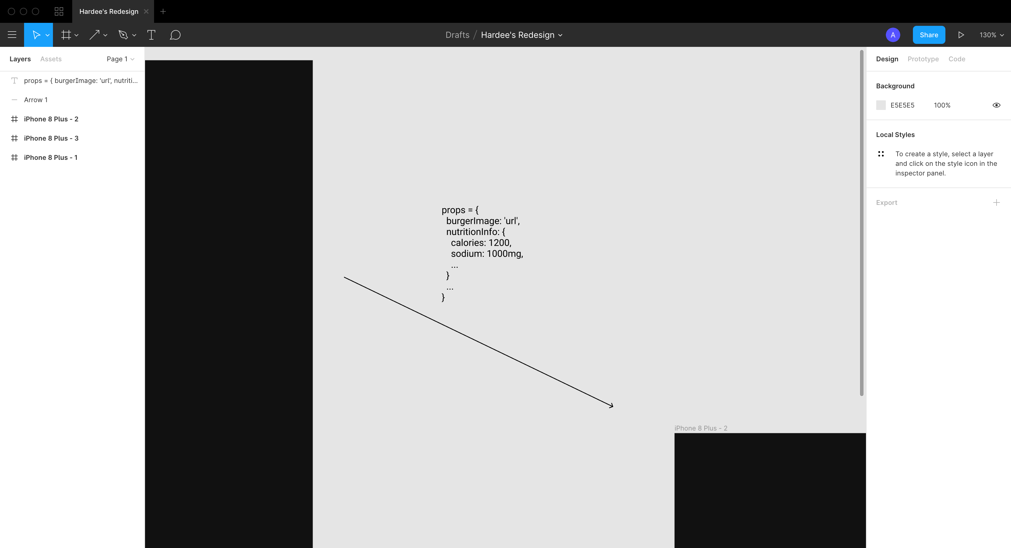
Start with this sample, and then illustrate how you would pass props between views:
props = {
  burgerImage: 'url',
  nutritionInfo: {
    calories: 1200,
    sodium: 1000mg,
    ...
  }
  ...
}
Then place them into your Figma document:
At this point, you've successfully created an app mockup and provided enough information for the entire team to build the app! If you'd like, go ahead and build out this front-end with mock-data of your choice.


 React
React
 Typescript
 Django
 Laravel
 Facebook
 Microsoft
 Google
 Alibaba
 D3
D3
 Tencent