Coder Social home page Coder Social logo

bearstudio / start-ui-web Goto Github PK

View Code? Open in Web Editor NEW
1.3K 16.0 121.0 14.63 MB

πŸš€ Start UI [web] is an opinionated UI starter with 🟦 TypeScript, βš›οΈ React, ⚫️ NextJS, ⚑️ Chakra UI, 🟦 tRPC, β–² Prisma, πŸ–οΈ TanStack Query, πŸ“• Storybook, 🎭 Playwright,πŸ“‹ React Hook Form,β—½From the 🐻 BearStudio Team

Home Page: https://demo.start-ui.com

License: MIT License

JavaScript 1.06% TypeScript 98.68% Shell 0.02% HTML 0.05% Dockerfile 0.19%
chakra-ui reactjs react-query nextjs typescript hacktoberfest react starter storybook web

start-ui-web's Introduction

Start UI Web

Discord

πŸš€ Start UI [web] is an opinionated frontend starter repository created & maintained by the BearStudio Team and other contributors. It represents our team's up-to-date stack that we use when creating web apps for our clients.

Documentation

For detailed information on how to use this project, please refer to the documentation. The documentation contains all the necessary information on installation, usage, and some guides.

Demo

A live read-only demonstration of what you will have when starting a project with πŸš€ Start UI [web] is available on demo.start-ui.com.

Technologies

Technologies logos of the starter

🟦 TypeScript, βš›οΈ React, ⚫️ NextJS, ⚑️ Chakra UI, 🟦 tRPC, β–² Prisma, πŸ–οΈ TanStack Query, πŸ“• Storybook, 🎭 Playwright, πŸ“‹ React Hook Form , 🌍 React i18next

Requirements

Getting Started

pnpm create start-ui --web myApp

That will scaffold a new folder with the latest version of πŸš€ Start UI [web] πŸŽ‰

Installation

  1. Duplicate the .env.example file to a new .env file, and update the environment variables
cp .env.example .env

Note

Quick advices for local development

  • DON'T update the EMAIL_SERVER variable, because the default value will be used to catch the emails during the development.
  1. Install dependencies
pnpm install
  1. Setup and start the db with docker
pnpm dk:init

Note

Don't want to use docker?

Setup a PostgreSQL database (locally or online) and replace the DATABASE_URL environment variable. Then you can run pnpm db:push to update your database schema and then run pnpm db:seed to seed your database.

Development

# Run the database in Docker (if not already started)
pnpm dk:start
# Run the development server
pnpm dev

Emails in development

Maildev to catch emails

In development, the emails will not be sent and will be catched by maildev.

The maildev UI is available at 0.0.0.0:1080.

Preview emails

Emails templates are built with react-email components in the src/emails folder.

You can preview an email template at http://localhost:3000/devtools/email/{template} where {template} is the name of the template file in the src/emails/templates folder.

Example: Login Code

Email translation preview

Add the language in the preview url like http://localhost:3000/devtools/email/{template}/{language} where {language} is the language key (en, fr, ...)

Email props preview

You can add search params to the preview url to pass as props to the template. http://localhost:3000/devtools/email/{template}/?{propsName}={propsValue}

Storybook

pnpm storybook

Update theme typing

When adding or updating theme components, component variations, sizes, colors and other theme foundations, you can extend the internal theme typings to provide nice autocomplete.

Just run the following command after updating the theme:

pnpm theme:generate-typing

Generate custom icons components from svg files

Put the custom svg files into the src/components/Icons/svg-sources folder and then run the following command:

pnpm theme:generate-icons

Warning

All svg icons should be svg files prefixed by icon- (example: icon-externel-link) with 24x24px size, only one shape and filled with #000 color (will be replaced by currentColor).

Update color mode storage key

You can update the storage key used to detect the color mode by updating this constant in the src/theme/config.ts file:

export const COLOR_MODE_STORAGE_KEY = 'start-ui-color-mode'; // Update the key according to your needs

E2E Tests

E2E tests are setup with Playwright.

pnpm e2e     # Run tests in headless mode, this is the command executed in CI
pnpm e2e:ui  # Open a UI which allow you to run specific tests and see test execution

Tests are written in the e2e folder; there is also a e2e/utils folder which contains some utils to help writing tests.

Show hint on development environments

Setup the NEXT_PUBLIC_ENV_NAME env variable with the name of the environment.

NEXT_PUBLIC_ENV_NAME="staging"
NEXT_PUBLIC_ENV_EMOJI="πŸ”¬"
NEXT_PUBLIC_ENV_COLOR_SCHEME="teal"

Translations

Setup the i18n Ally extension

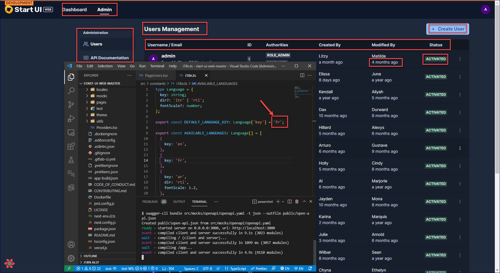
We recommended using the i18n Ally plugin for VS Code for translations management.

Create or edit the .vscode/settings.json file with the following settings:

{
  "i18n-ally.localesPaths": ["src/locales"],
  "i18n-ally.keystyle": "nested",
  "i18n-ally.enabledFrameworks": ["general", "react", "i18next"],
  "i18n-ally.namespace": true,
  "i18n-ally.defaultNamespace": "common",
  "i18n-ally.extract.autoDetect": true,
  "i18n-ally.keysInUse": ["common.languages.*"]
}

Production

pnpm install
pnpm storybook:build # Optional: Will expose the Storybook at `/storybook`
pnpm build
pnpm start

Deploy with Docker

  1. Build the Docker image (replace start-ui-web with your project name)
docker build -t start-ui-web .
  1. Run the Docker image (replace start-ui-web with your project name)
docker run -p 80:3000 start-ui-web

Application will be exposed on port 80 (http://localhost)

start-ui-web's People

Contributors

arinchaik avatar artfuldev avatar azizouertani avatar charlelisefouasse avatar d-campbell-bs avatar decampsrenan avatar deelanm avatar dependabot[bot] avatar dhananjay-jsr avatar dukent2903 avatar dylanflandrin avatar fabienessid avatar fanchgadjo avatar floriangille avatar gregoire-bearstudio avatar hugoperard avatar ivan-dalmet avatar jessy-baer avatar khannoussi-malek avatar killianpouliquen avatar laghzalitaha avatar malay-dev avatar medamineziraoui avatar ntatoud avatar omar-bear avatar philippe-tic avatar rileran avatar rodrigojmr avatar tibs245 avatar yoannfleurydev avatar

Stargazers

 avatar  avatar  avatar  avatar  avatar  avatar  avatar  avatar  avatar  avatar  avatar  avatar  avatar  avatar  avatar  avatar  avatar  avatar  avatar  avatar  avatar  avatar  avatar  avatar  avatar  avatar  avatar  avatar  avatar  avatar  avatar  avatar  avatar  avatar  avatar  avatar  avatar  avatar  avatar  avatar  avatar  avatar  avatar  avatar  avatar  avatar  avatar  avatar  avatar  avatar  avatar  avatar  avatar  avatar  avatar  avatar  avatar  avatar  avatar  avatar  avatar  avatar  avatar  avatar  avatar  avatar  avatar  avatar  avatar  avatar  avatar  avatar  avatar  avatar  avatar  avatar  avatar  avatar  avatar  avatar  avatar  avatar  avatar  avatar  avatar  avatar  avatar  avatar  avatar  avatar  avatar  avatar  avatar  avatar  avatar  avatar  avatar  avatar  avatar  avatar

Watchers

 avatar  avatar  avatar  avatar  avatar  avatar  avatar  avatar  avatar  avatar  avatar  avatar  avatar  avatar  avatar

start-ui-web's Issues

Enhance DX by integrating prettier in eslint command (Proposition)

I create this issue in order to integrate prettier checks in eslint command, here are the following benefits :

  • Enhance the developer experience by fixing automatically prettier and eslint (by configuring auto fix)
  • Prevent conflicts between prettier and eslint when a user choose a custom configuration
  • Less time for pre-commit
  • fix the problem of the end of line (sometimes change from lf to crlf, you can check husky gitignor file you will find a wrong push due to this problem)

Here is my PR for this issue #76 , i'm waiting your feedback and point of view about that ;)

Document API contract

The idea is to create an API contract based on what we used (now we use some parts of the API contract of Jhipster).
This way, any developer that needs a UI car start with start-ui and they "just" have to develop the API endpoints by matching the API contract of start-ui

  • Document all API urls used and payload values used (in/out).
  • Add types for all payloads

Fix DayPicker component style using Grid

For now, the DayPicker component is using table, table-cell and table-row display properties.
In some cases, we could have some issues with the width and the height of the days in the calendar.

I suggest to fix the component using display: grid. It will be more efficient and it could be manage easily.

Code to implement : Editable component

I suggest you my whole component : Editable
I think we will need to make some adjustments like using Typescript.
Here is the entire code :

Editable.js
import React, { Fragment, useState } from 'react';

import {
  ButtonGroup,
  Flex,
  IconButton,
  Text,
  Textarea,
} from '@chakra-ui/react';
import PropTypes from 'prop-types';
import { useTranslation } from 'react-i18next';
import { HiCheck, HiPencilAlt, HiX } from 'react-icons/hi';
import TextareaAutosize from 'react-textarea-autosize';

export const Editable = ({
  value,
  onSubmit,
  onChange,
  onCancel,
  isSubmitDisabled,
  ...rest
}) => {
  const { t } = useTranslation();

  const [isEditing, setIsEditing] = useState(false);
  const [content, setContent] = useState(value);

  const handleEdit = () => {
    if (isEditing) {
      setIsEditing(false);
      onSubmit(content.trim());
      return;
    }

    setIsEditing(true);
    setContent(value);
  };

  const handleCancel = () => {
    setContent(value);
    setIsEditing((x) => !x);
    onCancel(value);
  };

  const handleChange = (e) => {
    setContent(e.target?.value);

    onChange(e);
  };

  return (
    <Flex alignItems="flex-start" {...rest}>
      {isEditing ? (
        <Textarea
          as={TextareaAutosize}
          value={content}
          transition="none"
          ml="-0.5rem"
          mr={3}
          px={2}
          py={1}
          minH={4}
          autoFocus
          maxRows="10"
          onChange={handleChange}
        />
      ) : (
        <Text
          flexGrow={1}
          color="gray.500"
          lineHeight="1.375" // set this lineHeight to be the same as textarea default lineHeight
          py={1}
          mr={2}
        >
          {(value || '').split('\n').map((item, key) => (
            <Fragment key={key}>
              {item}
              <br />
            </Fragment>
          ))}
        </Text>
      )}
      <ButtonGroup size="sm">
        {isEditing && (
          <IconButton
            aria-label={t('components.editable.cancel')}
            onClick={handleCancel}
            icon={<HiX />}
          />
        )}
        <IconButton
          aria-label={
            isEditing
              ? t('components.editable.submit')
              : t('components.editable.edit')
          }
          isDisabled={isSubmitDisabled}
          onClick={handleEdit}
          icon={isEditing ? <HiCheck /> : <HiPencilAlt />}
        />
      </ButtonGroup>
    </Flex>
  );
};

Editable.propTypes = {
  value: PropTypes.string,
  onSubmit: PropTypes.func,
  onChange: PropTypes.func,
  onCancel: PropTypes.func,
  isSubmitDisabled: PropTypes.bool,
};

Editable.defaultProps = {
  value: '',
  onSubmit: () => {},
  onChange: () => {},
  onCancel: () => {},
  isSubmitDisabled: false,
};
Editable.stories.mdx
import { Editable } from './Editable';

export default {
  title: 'components/Editable',
  component: Editable,
};

export const Default = () => <Editable />;

export const UsageWithValue = () => <Editable value="One Prepaid" />;

export const UsageWithTriggeredEvents = () => {
  const handleCancel = (value) => {
    console.log('Cancel', { value });
  };

  const handleSubmit = (value) => {
    console.log('Submit', { value });
  };

  const handleChange = (e) => {
    console.log('Change', { value: e.target.value });
  };

  return (
    <Editable
      onCancel={handleCancel}
      onSubmit={handleSubmit}
      onChange={handleChange}
    />
  );
};

Result example :
https://user-images.githubusercontent.com/50022361/106932147-aaa85780-6717-11eb-8efc-52e68361588f.mp4

FieldCheckboxes doesn't work with object values

Description

The component FieldCheckboxes doesn't work with object values in options.

Is that a normal behavior ? Maybe the value should only be a string but that would limit the usefulness of the FieldCheckboxes component.

Example

In this example, the checkbox won't change their state if you click on them.

withNestedValues

export const WithNestedValues = () => {
  const options = [
    { value: {firstName: 'Alice', age: 22}, label: 'Alice' },
    { value: {firstName: 'Bob', age: 23}, label: 'Bob' }
  ];

  return (
    <Formiz>
      <FieldCheckboxes
        name="FieldCheckboxes"
        label="Label"
        helper="Helper"
        options={options}
      />
    </Formiz>
  );
};

Code to implement : DayPicker & DayPickerRange

I suggest you my whole components : DayPicker & DayPickerRange.
I think we will need to make some adjustments like using Typescript or update the style according to Start-UI.
Here is the entire code :

DayPicker component

⚠️ This component is using Dayjs with the following plugins : custom-parse-format, locale-data, localized-format

DayPicker.js
import React, { useState, forwardRef } from 'react';

import {
  Box,
  Input,
  InputGroup,
  InputRightElement,
  useBreakpointValue,
} from '@chakra-ui/react';
import dayjs from 'dayjs';
import PropTypes from 'prop-types';
import { DateUtils } from 'react-day-picker';
import DayPickerInput from 'react-day-picker/DayPickerInput';
import { FaCalendar } from 'react-icons/fa';

const FORMAT = 'L';

const ReactDayPickerInput = forwardRef(({ isDisabled, ...otherProps }, ref) => (
  <InputGroup>
    <Input
      ref={ref}
      focusBorderColor="brandSecondary.600"
      backgroundColor="white"
      pr="2.75rem"
      isDisabled={isDisabled}
      {...otherProps}
    />
    <InputRightElement
      color={`gray.${isDisabled ? '200' : '400'}`}
      width="2.75rem"
      zIndex={1}
    >
      <FaCalendar />
    </InputRightElement>
  </InputGroup>
));

export const DayPicker = forwardRef(
  (
    {
      name,
      isDisabled,
      defaultValue,
      placeholder,
      onChange,
      dayPickerProps,
      inputProps,
      containerProps,
      ...otherProps
    },
    ref
  ) => {
    const globalLocaleData = dayjs.localeData();
    const MONTHS = globalLocaleData.months();
    const WEEKDAYS_LONG = globalLocaleData.weekdays();
    const WEEKDAYS_SHORT = globalLocaleData.weekdaysShort();

    const isSmartphoneFormat = useBreakpointValue({ base: true, md: false });
    const [selectedDay, setSelectedDay] = useState(defaultValue);

    const handleDayChange = (day, modifiers) => {
      if (modifiers.disabled) {
        setSelectedDay(null);
        return;
      }

      setSelectedDay(day);
      onChange(day);
    };

    const formatDate = (date, format) => dayjs(date).format(format);

    const parseDate = (str, format, locale) => {
      const parsed = dayjs(str, format, locale).toDate();
      if (DateUtils.isDate(parsed)) {
        return parsed;
      }

      return null;
    };

    return (
      <Box w="100%" position="relative" {...containerProps}>
        <DayPickerInput
          ref={ref}
          component={ReactDayPickerInput}
          onDayChange={handleDayChange}
          value={selectedDay}
          formatDate={formatDate}
          format={FORMAT}
          placeholder={placeholder}
          parseDate={parseDate}
          dayPickerProps={{
            months: MONTHS,
            weekdaysLong: WEEKDAYS_LONG,
            weekdaysShort: WEEKDAYS_SHORT,
            firstDayOfWeek: 1,
            locale: dayjs().locale(),
            ...dayPickerProps,
          }}
          {...otherProps}
          inputProps={{
            name,
            isDisabled,
            readOnly: isSmartphoneFormat,
            ...inputProps,
          }}
        />
      </Box>
    );
  }
);

DayPicker.propTypes = {
  name: PropTypes.string,
  isDisabled: PropTypes.bool,
  defaultValue: PropTypes.instanceOf(Date),
  placeholder: PropTypes.string,
  onChange: PropTypes.func,
  dayPickerProps: PropTypes.object,
  inputProps: PropTypes.object,
  containerProps: PropTypes.object,
};

DayPicker.defaultProps = {
  name: '',
  isDisabled: false,
  defaultValue: null,
  placeholder: '',
  onChange: () => {},
  dayPickerProps: {},
  inputProps: {},
  containerProps: {},
};

ReactDayPickerInput.propTypes = {
  isDisabled: PropTypes.bool,
};

ReactDayPickerInput.defaultProps = {
  isDisabled: false,
};
DayPicker.stories.js
import React from 'react';

import { HStack, Button, Box } from '@chakra-ui/react';
import dayjs from 'dayjs';
import { useTranslation } from 'react-i18next';

import { DayPicker } from './DayPicker';

export default {
  title: 'components/DayPicker',
  component: DayPicker,
};

export const Default = () => {
  const { i18n } = useTranslation();

  const handleChangeLang = (lang) => {
    i18n.changeLanguage(lang);
  };

  return (
    <HStack>
      <DayPicker />
      <Button onClick={() => handleChangeLang('en-EN')}>en-EN</Button>
      <Button onClick={() => handleChangeLang('fr-FR')}>fr-FR</Button>
    </HStack>
  );
};
Default.decorators = [
  (Story) => (
    <Box h="24rem">
      <Story />
    </Box>
  ),
];

export const DayPickerWithDefaultValue = () => {
  dayjs.locale('fr');

  return (
    <DayPicker
      defaultValue={dayjs('24/05/2021', 'L', dayjs.locale()).toDate()}
    />
  );
};
DayPickerWithDefaultValue.decorators = [
  (Story) => (
    <Box h="24rem">
      <Story />
    </Box>
  ),
];

export const DayPickerWithDisabledDays = () => {
  dayjs.locale('fr');

  const addDay = (days) => dayjs().add(days, 'days').toDate();

  return (
    <DayPicker
      dayPickerProps={{
        disabledDays: [
          { daysOfWeek: [0, 1, 6] },
          { before: new Date() },
          { after: addDay(10) },
          addDay(3),
        ],
      }}
    />
  );
};
DayPickerWithDisabledDays.decorators = [
  (Story) => (
    <Box h="24rem">
      <Story />
    </Box>
  ),
];

export const DayPickerWithAnOtherLocale = () => {
  dayjs.locale('en');

  return (
    <DayPicker
      defaultValue={dayjs('05/24/2021', 'L', dayjs.locale()).toDate()}
    />
  );
};
DayPickerWithAnOtherLocale.decorators = [
  (Story) => (
    <Box h="24rem">
      <Story />
    </Box>
  ),
];

export const DisabledDayPicker = () => (
  <DayPicker placeholder="Disabled Day Picker" isDisabled />
);

DayPickerRange component

DayPickerRange.js
import React, { useState, useRef, forwardRef } from 'react';

import {
  Flex,
  Input,
  InputGroup,
  InputRightElement,
  Text,
} from '@chakra-ui/react';
import dayjs from 'dayjs';
import PropTypes from 'prop-types';
import { FaCalendar } from 'react-icons/fa';

import { DayPicker } from '../DayPicker/DayPicker';

const InputComponent = forwardRef(({ isDisabled, ...otherProps }, ref) => (
  <InputGroup>
    <Input
      ref={ref}
      border="none"
      borderRadius="0"
      focusBorderColor="0"
      backgroundColor="inherit"
      isDisabled={isDisabled}
      {...otherProps}
    />
  </InputGroup>
));

InputComponent.propTypes = {
  isDisabled: PropTypes.bool,
};
InputComponent.defaultProps = {
  isDisabled: false,
};

export const DayPickerRange = ({
  onChange,
  onRangeChange,
  fromDayPickerProps,
  toDayPickerProps,
  dayPickerProps,
  containerProps,
  inputProps,
  isDisabled,
  ...props
}) => {
  const [range, setRange] = useState({
    from: fromDayPickerProps.defaultValue || null,
    to: toDayPickerProps.defaultValue || null,
  });
  const toDayPickerRef = useRef();

  const showFromMonth = () => {
    const { from, to } = range;

    if (!from) return;
    if (dayjs(to).diff(dayjs(from), 'month') < 2 && toDayPickerRef?.current) {
      const dayPicker = toDayPickerRef.current.getDayPicker();
      if (dayPicker) {
        dayPicker.showMonth(from);
      }
    }
  };

  const handleDayFromClick = (day, modifiers) => {
    if (modifiers.disabled) {
      setRange((previousRange) => ({ ...previousRange, from: null }));
      onChange({ from: null, to: range.to });
      return;
    }

    if (range.to && day && dayjs(range.to).isBefore(dayjs(day))) {
      const toDate = dayjs(range.to);
      const fromDate = dayjs(day);

      if (toDate.isBefore(fromDate, 'date')) {
        setRange({ from: day, to: null });
        onChange({ from: day, to: null });
        return;
      }
    }

    setRange((previousRange) => ({ ...previousRange, from: day }));
    onChange({ from: day, to: range.to });

    if ((!!day && !!range.to) || (!day && !range.to)) {
      onRangeChange({ from: day, to: range.to });
    }
  };

  const handleDayToClick = (day, modifiers) => {
    if (modifiers.disabled) {
      setRange((previousRange) => ({ ...previousRange, to: null }));
      onChange({ from: range.from, to: null });
      return;
    }
    setRange((previousRange) => ({ ...previousRange, to: day }));
    onChange({ from: range.from, to: day });

    if ((!!range.from && !!day) || (!range.from && !day)) {
      onRangeChange({ from: range.from, to: day });
    }
  };

  const { from, to } = range;
  const modifiers = { start: from, end: to };

  const commonProps = {
    defaultProps: {
      placeholder: '',
      component: InputComponent,
      isDisabled,
    },
    dayPickerProps: {
      selectedDays: [from, { from, to }, to],
      modifiers,
      numberOfMonths: 2,
    },
    containerProps: {
      position: 'static',
      minWidth: '10ch',
      width: '100%',
    },
    inputProps: {
      textAlign: 'center',
      p: 0,
    },
  };

  return (
    <InputGroup {...(containerProps.inputGroup || {})}>
      <Input
        as={Flex}
        className="DayPickerRange"
        alignItems="center"
        justifyContent="center"
        w="100%"
        isDisabled={isDisabled}
        {...(containerProps.input || {})}
      >
        <DayPicker
          value={from}
          onDayChange={handleDayFromClick}
          isDisabled={isDisabled}
          {...commonProps.defaultProps}
          {...props}
          {...fromDayPickerProps}
          dayPickerProps={{
            onDayClick: () => toDayPickerRef?.current?.getInput()?.focus(),
            ...commonProps.dayPickerProps,
            ...(dayPickerProps || {}),
            ...(fromDayPickerProps.dayPickerProps || {}),
          }}
          containerProps={{
            ...commonProps.containerProps,
            ...(fromDayPickerProps.containerProps || {}),
          }}
          inputProps={{
            ...commonProps.inputProps,
            ...(inputProps || {}),
            ...(fromDayPickerProps.inputProps || {}),
          }}
        />
        <Text {...(isDisabled ? { color: 'gray.300' } : {})}>{' - '}</Text>
        <DayPicker
          ref={toDayPickerRef}
          value={to}
          onDayChange={handleDayToClick}
          onDayPickerShow={showFromMonth}
          isDisabled={isDisabled}
          {...commonProps.defaultProps}
          {...props}
          {...toDayPickerProps}
          dayPickerProps={{
            disabledDays: { before: from },
            month: from,
            fromMonth: from,
            ...commonProps.dayPickerProps,
            ...(dayPickerProps || {}),
            ...(toDayPickerProps.dayPickerProps || {}),
          }}
          containerProps={{
            ...commonProps.containerProps,
            ...(toDayPickerProps.containerProps || {}),
          }}
          inputProps={{
            ...commonProps.inputProps,
            ...(inputProps || {}),
            ...(toDayPickerProps.inputProps || {}),
          }}
        />
      </Input>
      <InputRightElement
        color={`gray.${isDisabled ? '200' : '400'}`}
        width="2.75rem"
        zIndex={1}
      >
        <FaCalendar />
      </InputRightElement>
    </InputGroup>
  );
};

DayPickerRange.propTypes = {
  onChange: PropTypes.func,
  onRangeChange: PropTypes.func,
  fromDayPickerProps: PropTypes.object,
  toDayPickerProps: PropTypes.object,
  dayPickerProps: PropTypes.object,
  containerProps: PropTypes.object,
  inputProps: PropTypes.object,
  isDisabled: PropTypes.bool,
};

DayPickerRange.defaultProps = {
  onChange: () => {},
  onRangeChange: () => {},
  fromDayPickerProps: {},
  toDayPickerProps: {},
  dayPickerProps: {},
  containerProps: { inputGroup: {}, input: {} },
  inputProps: {},
  isDisabled: false,
};
DayPickerRange.stories.js
import React from 'react';

import { HStack, Button, Box } from '@chakra-ui/react';
import dayjs from 'dayjs';
import { useTranslation } from 'react-i18next';

import { DayPickerRange } from './DayPickerRange';

export default {
  title: 'components/DayPickerRange',
  component: DayPickerRange,
};

export const Default = () => {
  const { i18n } = useTranslation();

  const handleChangeLang = (lang) => {
    i18n.changeLanguage(lang);
  };

  return (
    <HStack>
      <DayPickerRange />
      <Button onClick={() => handleChangeLang('en-EN')}>en-EN</Button>
      <Button onClick={() => handleChangeLang('fr-FR')}>fr-FR</Button>
    </HStack>
  );
};
Default.decorators = [
  (Story) => (
    <Box h="24rem">
      <Story />
    </Box>
  ),
];

export const DayPickerRangeWithCommonProps = () => (
  <DayPickerRange
    dayPickerProps={{
      disabledDays: { daysOfWeek: [0, 1, 2] },
      numberOfMonths: 1,
    }}
  />
);
DayPickerRangeWithCommonProps.decorators = [
  (Story) => (
    <Box h="24rem">
      <Story />
    </Box>
  ),
];

export const DayPickerRangeWithSpecificProps = () => (
  <DayPickerRange
    fromDayPickerProps={{
      dayPickerProps: {
        disabledDays: { daysOfWeek: [0, 1, 2] },
        numberOfMonths: 1,
      },
    }}
    toDayPickerProps={{
      dayPickerProps: {
        disabledDays: { daysOfWeek: [3, 4, 5, 6] },
        numberOfMonths: 2,
      },
    }}
  />
);
DayPickerRangeWithSpecificProps.decorators = [
  (Story) => (
    <Box h="24rem">
      <Story />
    </Box>
  ),
];

export const DayPickerRangeWithCommonAndSpecificProps = () => (
  <DayPickerRange
    dayPickerProps={{
      initialMonth: dayjs().add(1, 'month').toDate(),
    }}
    fromDayPickerProps={{
      dayPickerProps: {
        disabledDays: { daysOfWeek: [0, 1, 2] },
        numberOfMonths: 1,
      },
    }}
    toDayPickerProps={{
      dayPickerProps: {
        disabledDays: { daysOfWeek: [3, 4, 5, 6] },
        numberOfMonths: 2,
      },
    }}
  />
);
DayPickerRangeWithCommonAndSpecificProps.decorators = [
  (Story) => (
    <Box h="24rem">
      <Story />
    </Box>
  ),
];

export const DayPickerRangeWithDefaultValue = () => {
  dayjs.locale('fr');

  return (
    <DayPickerRange
      fromDayPickerProps={{
        defaultValue: dayjs('24/05/2021', 'L', dayjs.locale()).toDate(),
      }}
      toDayPickerProps={{
        defaultValue: dayjs('26/05/2021', 'L', dayjs.locale()).toDate(),
      }}
    />
  );
};
DayPickerRangeWithDefaultValue.decorators = [
  (Story) => (
    <Box h="24rem">
      <Story />
    </Box>
  ),
];

export const DayPickerRangeWithDisabledDays = () => {
  dayjs.locale('fr');

  const addDay = (days) => dayjs().add(days, 'days').toDate();
  const disabledDays = [
    { daysOfWeek: [0, 6] },
    { before: new Date() },
    { after: addDay(10) },
    addDay(3),
  ];

  return <DayPickerRange dayPickerProps={{ disabledDays }} />;
};
DayPickerRangeWithDisabledDays.decorators = [
  (Story) => (
    <Box h="24rem">
      <Story />
    </Box>
  ),
];

export const DayPickerRangeWithAnOtherLocale = () => {
  dayjs.locale('en');

  return (
    <DayPickerRange
      fromDayPickerProps={{
        defaultValue: dayjs('05/24/2021', 'L', dayjs.locale()).toDate(),
      }}
      toDayPickerProps={{
        defaultValue: dayjs('05/26/2021', 'L', dayjs.locale()).toDate(),
      }}
    />
  );
};
DayPickerRangeWithAnOtherLocale.decorators = [
  (Story) => (
    <Box h="24rem">
      <Story />
    </Box>
  ),
];

export const DisabledDayPickerRange = () => (
  <DayPickerRange isDisabled placeholder="Disabled DayPicker" />
);

DayPicker & DayPickerRange styles

reactDayPicker.js
import 'react-day-picker/lib/style.css';

export const reactDayPicker = {
  '.DayPickerInput': {
    display: 'inline-block',
    fontSize: '0.1em',
    width: '100%',
  },

  '.DayPickerInput-OverlayWrapper': {
    position: 'static',
    width: '100%',
    maxWidth: '50vw',
  },

  '.DayPickerInput-Overlay': {
    marginTop: '3em',
    position: 'absolute',
    left: '0',
    zIndex: 2,
    borderRadius: 'md',
    boxShadow: 'lg',
  },

  '.DayPicker': {
    display: 'inline-block',
    fontSize: { base: '0.8rem', sm: '1rem' },
    border: '1px solid',
    borderColor: 'gray.200',
    borderRadius: 'md',
    maxWidth: 'fit-content',
  },

  '.DayPicker-Months': {
    display: 'grid',
    gridTemplateColumns: { base: 'repeat(1, 1fr)', md: 'repeat(2, 1fr)' },
  },

  '.DayPicker-Day--outside': {
    backgroundColor: 'transparent!important',
  },

  '.DayPicker-Day--disabled, .DayPicker-Day--today.DayPicker-Day--disabled': {
    pointerEvents: 'none',
  },

  '.DayPicker-Day--today.DayPicker-Day--disabled': {
    color: 'gray.400',
  },

  '.DayPicker-Day--selected:not(.DayPicker-Day--disabled):not(.DayPicker-Day--outside)': {
    position: 'relative',
    backgroundColor: 'primary.500',
    borderRadius: '100%',
  },

  '.DayPicker-Day--selected:not(.DayPicker-Day--disabled):not(.DayPicker-Day--outside):hover': {
    backgroundColor: 'primary.500',
    borderRadius: '100%',
    color: 'white',
  },

  '.DayPicker:not(.DayPicker--interactionDisabled)': {
    '.DayPicker-Day:not(.DayPicker-Day--disabled):not(.DayPicker-Day--selected):not(.DayPicker-Day--outside):hover': {
      backgroundColor: 'primary.100',
      borderRadius: '100%',
    },

    '.DayPicker-Day:not(.DayPicker-Day--disabled):not(.DayPicker-Day--selected):not(.DayPicker-Day--outside):not(.DayPicker-Day--today):hover': {
      color: 'black',
    },

    '.DayPicker-Day--today:not(.DayPicker-Day--selected)': {
      color: 'primary.500',
    },

    '.DayPicker-Day--today.DayPicker-Day--disabled': {
      color: 'primary.100',
    },
  },

  '.DayPicker-Day': {
    display: 'block',
    borderRadius: 'full',
    cursor: 'pointer',
    height: '2.8em',
    minWidth: '2.8em',
    transition: '0.2s',
    padding: 0,
    lineHeight: '2.8em',
  },

  '.DayPicker-Day--today': {
    color: 'primary.500',
    fontWeight: 'bold',
  },

  '.DayPicker-Caption': {
    display: 'block',
  },

  '.DayPicker-Caption > div': {
    fontWeight: '400',
    fontSize: '1em',
  },

  '.DayPicker-Weekdays': {
    display: 'block',
  },

  '.DayPicker-WeekdaysRow': {
    display: 'grid',
    gridTemplateColumns: 'repeat(7, 1fr)',
  },

  '.DayPicker-Weekday': {
    display: 'block',
    fontWeight: '350',
    color: 'black',
    fontSize: '0.875em',
  },

  '.DayPicker-Body': {
    display: 'grid',
  },

  '.DayPicker-Week': {
    display: 'grid',
    gridTemplateColumns: 'repeat(7, 1fr)',
  },

  '.DayPickerRange .DayPicker-Day--selected:not(.DayPicker-Day--disabled), .DayPickerRange .DayPicker-Day--selected:not(.DayPicker-Day--disabled):hover': {
    borderRadius: '0',
  },

  '.DayPickerRange .DayPicker-Day--selected:not(.DayPicker-Day--start):not(.DayPicker-Day--end):not(.DayPicker-Day--disabled)': {
    backgroundColor: 'primary.100',
  },

  '.DayPickerRange .DayPicker-Day--selected.DayPicker-Day--start:not(.DayPicker-Day--disabled):not(.DayPicker-Day--outside)': {
    borderTopLeftRadius: '50%',
    borderBottomLeftRadius: '50%',
    borderTopRightRadius: 0,
    borderBottomRightRadius: 0,
  },

  '.DayPickerRange .DayPicker-Day--selected.DayPicker-Day--end:not(.DayPicker-Day--disabled):not(.DayPicker-Day--outside)': {
    borderTopRightRadius: '50%',
    borderBottomRightRadius: '50%',
    borderTopLeftRadius: 0,
    borderBottomLeftRadius: 0,
  },

  '.DayPickerRange .DayPicker-Day--selected.DayPicker-Day--start, .DayPickerRange .DayPicker-Day--selected.DayPicker-Day--end': {
    backgroundColor: 'primary.500',
  },

  '.DayPickerRange .DayPicker-Day--start.DayPicker-Day--end:not(.DayPicker-Day--disabled):not(.DayPicker-Day--outside)': {
    borderRadius: '100%',
  },
};

Results examples :
https://user-images.githubusercontent.com/50022361/106932621-3de18d00-6718-11eb-826b-568c2ca881ed.mp4
https://user-images.githubusercontent.com/50022361/106932633-420daa80-6718-11eb-81be-5e681f62d4ea.mp4

Code to implement : Select component

⚠️ Import of the theme

import React, { useRef } from 'react';

import { Box, useTheme } from '@chakra-ui/react';
import PropTypes from 'prop-types';
import ReactSelect from 'react-select';
import AsyncReactSelect from 'react-select/async';
import AsyncCreatableReactSelect from 'react-select/async-creatable';
import CreatableReactSelect from 'react-select/creatable';

import { extranetTheme } from '@/theme/extranetTheme';

export const convertStringToChakraUIColor = (colorToConvert, defaultColor) => {
  const split = (colorToConvert || '').split('.');
  if (colorToConvert && split.length === 1) return colorToConvert;
  if (split.length !== 2) return defaultColor;

  const [color, shade] = split;
  const chakraUIColor = extranetTheme.colors[color][shade];

  return chakraUIColor || defaultColor;
};

export const Select = ({
  errorBorderColor,
  focusBorderColor,
  optionsColor,
  isAsync,
  isCreatable,
  isError,
  noOptionsMessage,
  loadingMessage,
  formatCreateLabel,
  placeholder,
  loadOptions,
  defaultOptions,
  debounceDelay,
  containerProps,
  ...otherProps
}) => {
  const chakraUITheme = useTheme();
  const Element =
    isAsync && isCreatable
      ? AsyncCreatableReactSelect
      : isAsync
      ? AsyncReactSelect
      : isCreatable
      ? CreatableReactSelect
      : ReactSelect;

  let debounceTimeout = useRef();

  const debounce = (func, delay) => {
    clearTimeout(debounceTimeout.current);
    return new Promise((resolve) => {
      debounceTimeout.current = setTimeout(async () => {
        const result = await func();
        resolve(result);
      }, delay);
    });
  };

  const asyncProps = isAsync
    ? {
        defaultOptions,
        cacheOptions: true,
        loadOptions: (input) =>
          debounce(() => loadOptions(input), debounceDelay),
      }
    : {};

  const selectStyle = {
    control: (provided, { isFocused }) => {
      const borderColor = convertStringToChakraUIColor(
        focusBorderColor,
        chakraUITheme.colors.blue['500']
      ); // to have the same border colors than the inputs

      if (isFocused) {
        return {
          ...provided,
          ...(borderColor
            ? {
                borderColor,
                boxShadow: `0 0 0 1px ${borderColor}`,
                '&:hover': { borderColor },
              }
            : {}),
        };
      }

      return provided;
    },
    option: (provided, { isFocused, isSelected }) => {
      let backgroundColor = null;
      let color = null;
      if (isFocused) {
        backgroundColor = convertStringToChakraUIColor(
          optionsColor.hover,
          chakraUITheme.colors.info['100']
        );
        color = 'black';
      } else if (isSelected) {
        backgroundColor = convertStringToChakraUIColor(
          optionsColor.selected,
          chakraUITheme.colors.info['500']
        );
        color = 'white';
      }

      return {
        ...provided,
        ...(backgroundColor && color
          ? {
              backgroundColor,
              color,
              ':active': {
                backgroundColor: convertStringToChakraUIColor(
                  optionsColor.active,
                  chakraUITheme.colors.info['500']
                ),
                color: 'white',
              },
            }
          : {}),
      };
    },
    menu: (provided) => ({ ...provided, zIndex: 10 }),
  };

  const selectErrorStyle = {
    control: (provided, state) => {
      if (isError) {
        const borderColor = convertStringToChakraUIColor(
          errorBorderColor,
          chakraUITheme.colors.danger[500]
        );

        return {
          ...provided,
          borderColor,
          boxShadow: `0 0 0 1px ${borderColor}`,
          '&:hover': { borderColor },
        };
      }

      return { ...provided, ...selectStyle.control(provided, state) };
    },
  };

  return (
    <Box {...containerProps}>
      <Element
        styles={{ ...selectStyle, ...selectErrorStyle }}
        {...(noOptionsMessage
          ? { noOptionsMessage: () => noOptionsMessage }
          : {})}
        {...(loadingMessage ? { loadingMessage: () => loadingMessage } : {})}
        {...(formatCreateLabel ? { formatCreateLabel } : {})}
        placeholder={placeholder}
        {...asyncProps}
        {...otherProps}
      />
    </Box>
  );
};

Select.propTypes = {
  focusBorderColor: PropTypes.string,
  errorBorderColor: PropTypes.string,
  optionsColor: PropTypes.shape({
    hover: PropTypes.string,
    selected: PropTypes.string,
    active: PropTypes.string,
  }),
  isAsync: PropTypes.bool,
  isCreatable: PropTypes.bool,
  isError: PropTypes.bool,
  noOptionsMessage: PropTypes.string,
  loadingMessage: PropTypes.string,
  formatCreateLabel: PropTypes.func,
  placeholder: PropTypes.string,
  loadOptions: PropTypes.func,
  defaultOptions: PropTypes.oneOfType([PropTypes.bool, PropTypes.array]),
  debounceDelay: PropTypes.number,
  containerProps: PropTypes.object,
};

Select.defaultProps = {
  focusBorderColor: null,
  errorBorderColor: null,
  optionsColor: {
    hover: null,
    selected: null,
    active: null,
  },
  isAsync: false,
  isCreatable: false,
  isError: false,
  noOptionsMessage: null,
  loadingMessage: null,
  formatCreateLabel: null,
  placeholder: '',
  loadOptions: () => new Promise((resolve) => resolve()),
  defaultOptions: true,
  debounceDelay: 500,
  containerProps: {},
};
import React from 'react';

import { Box, Button, Flex } from '@chakra-ui/react';

import { Select } from './Select';

export default {
  title: 'components/Select',
  component: Select,
};

export const Default = () => {
  return (
    <Select
      options={[
        { value: 1, label: 'Option 1' },
        { value: 2, label: 'Option 2' },
        { value: 3, label: 'Option 3' },
      ]}
    />
  );
};
Default.decorators = [
  (Story) => (
    <Box h="24rem">
      <Story />
    </Box>
  ),
];

export const SelectWithDefaultValue = () => {
  return (
    <Select
      isMulti
      options={[
        { value: 1, label: 'Option 1' },
        { value: 2, label: 'Option 2' },
        { value: 3, label: 'Option 3' },
      ]}
      defaultValue={[
        { value: 2, label: 'Option 2' },
        { value: 3, label: 'Option 3' },
      ]}
    />
  );
};
SelectWithDefaultValue.decorators = [
  (Story) => (
    <Box h="24rem">
      <Story />
    </Box>
  ),
];

export const SelectWithPlaceholder = () => {
  return (
    <Select
      placeholder="Please select an option"
      noOptionsMessage="There is no options"
    />
  );
};
SelectWithPlaceholder.decorators = [
  (Story) => (
    <Box h="24rem">
      <Story />
    </Box>
  ),
];

export const DisabledSelect = () => {
  return <Select isDisabled />;
};
DisabledSelect.decorators = [
  (Story) => (
    <Box h="24rem">
      <Story />
    </Box>
  ),
];

export const IsErrorSelect = () => {
  return <Select isError />;
};
IsErrorSelect.decorators = [
  (Story) => (
    <Box h="24rem">
      <Story />
    </Box>
  ),
];

export const MultiSelect = () => {
  return (
    <Select
      isMulti
      options={[
        { value: 1, label: 'Option 1' },
        { value: 2, label: 'Option 2' },
      ]}
    />
  );
};
MultiSelect.decorators = [
  (Story) => (
    <Box h="24rem">
      <Story />
    </Box>
  ),
];

export const CreatableSelect = () => {
  return (
    <Select
      isCreatable
      formatCreateLabel={(input) => `Add other option : "${input}"`}
      options={[
        { value: 1, label: 'Option 1' },
        { value: 2, label: 'Option 2' },
      ]}
    />
  );
};
CreatableSelect.decorators = [
  (Story) => (
    <Box h="24rem">
      <Story />
    </Box>
  ),
];

export const NotSearchableSelect = () => {
  return (
    <Select
      isSearchable={false}
      options={[
        { value: 1, label: 'Option 1' },
        { value: 2, label: 'Option 2' },
      ]}
    />
  );
};
NotSearchableSelect.decorators = [
  (Story) => (
    <Box h="24rem">
      <Story />
    </Box>
  ),
];

export const AsyncSelect = () => {
  const options = [
    'red',
    'blue',
    'green',
    'orange',
    'purple',
    'lightgreen',
    'lightblue',
    'darkgreen',
    'darkblue',
    'yellow',
    'black',
    'white',
  ];

  const handleLoadOptions = async (inputValue) => {
    // Fake API call
    return await new Promise((resolve) =>
      setTimeout(
        () =>
          resolve(
            options
              .filter((option) => option.startsWith(inputValue))
              .map((option) => ({ label: option, value: option }))
          ),
        300
      )
    );
  };

  return (
    <Select
      isAsync
      isClearable
      loadOptions={handleLoadOptions}
      debounceDelay={300}
      defaultOptions={options.map((option) => ({
        label: option,
        value: option,
      }))}
    />
  );
};
AsyncSelect.decorators = [
  (Story) => (
    <Box h="24rem">
      <Story />
    </Box>
  ),
];

export const AsyncCreatableSelect = () => {
  const options = [
    'red',
    'blue',
    'green',
    'orange',
    'purple',
    'lightgreen',
    'lightblue',
    'darkgreen',
    'darkblue',
    'yellow',
    'black',
    'white',
  ];

  const handleLoadOptions = async (inputValue) => {
    // Fake API call
    return await new Promise((resolve) =>
      setTimeout(
        () =>
          resolve(
            options
              .filter((option) => option.startsWith(inputValue))
              .map((option) => ({ label: option, value: option }))
          ),
        300
      )
    );
  };

  return (
    <Select
      isAsync
      isCreatable
      isClearable
      loadOptions={handleLoadOptions}
      debounceDelay={300}
      defaultOptions={options.map((option) => ({
        label: option,
        value: option,
      }))}
    />
  );
};
AsyncCreatableSelect.decorators = [
  (Story) => (
    <Box h="24rem">
      <Story />
    </Box>
  ),
];

export const SelectWithSomeDisabledOptions = () => {
  return (
    <Select
      options={[
        { value: 1, label: 'Option 1' },
        { value: 2, label: 'Option 2', isDisabled: true },
        { value: 3, label: 'Option 3' },
      ]}
    />
  );
};
SelectWithSomeDisabledOptions.decorators = [
  (Story) => (
    <Box h="24rem">
      <Story />
    </Box>
  ),
];

export const SelectWithCustomColors = () => {
  const [isError, setIsError] = React.useState(false);

  const toggleError = () => {
    setIsError((x) => !x);
  };

  return (
    <Flex>
      <Select
        containerProps={{
          flexGrow: 1,
        }}
        focusBorderColor="info.500"
        isError={isError}
        errorBorderColor="danger.200"
        optionsColor={{
          hover: 'primary.100',
          selected: 'primary.500',
          active: 'danger.500',
        }}
        options={[
          { label: 'Option 1', value: 'option-1' },
          { label: 'Option 2', value: 'option-2' },
        ]}
      />
      <Button ml={3} onClick={toggleError}>
        Toggle isError
      </Button>
    </Flex>
  );
};
SelectWithCustomColors.decorators = [
  (Story) => (
    <Box h="24rem">
      <Story />
    </Box>
  ),
];

Add CI (GitHub Actions)

It could be great to add a CI pipeline to check for the types and the tests.

  • yarn tsc --noEmit
  • yarn test

PageUsers rerendering in an infinite loop

Hello, I think I have to ask you for help, I have tried for several days, but I can't solve it, I hope I can get your guidance, thank you very much!

I try to switch mock server to real API , After the switch, when I directly type http://localhost:3000/admin/management/users in the browser address bar, will cause PageUsers rerendering in an infinite loop.

image

But if when I first go to http://localhost:3000/admin/dashboard and click the MainMenu Admin from the TopBar, then the browser will jump to PageUsers, and everything is perfect, without infinite rendering.

image

but when I click the refresh button in the browser, infinite rendering loop happens again.

My question is:

  1. when I directly in the browser address bar, type http://localhost:3000/admin/management/users, can cause PageUsers rendering in an infinite loop, Is this a normal situation?
  2. If not, could you please give me some guidance to solve the problem?
    Thank you very much!

image

export const useUserList = ({ page = 0, size = 10 } = {}, config: any = {}) => {
  const [{ users, count: totalItems, hasMore }, { isLoading: isLoading, error, refetch }] =
    usePaginatedQuery(
      getUsers,
      {
        orderBy: { id: "asc" },
        skip: size * (page - 1),
        take: size,
      },
      {
        keepPreviousData: true,
        ...config,
      }
    )

  const totalPages = Math.ceil(totalItems / size)

  return {
    users,
    totalItems,
    hasMore,
    totalPages,
    isLoading,
  }
}

ReferenceError: window is not defined

When running yarn test on bare-bones start-ui project, the test fail.

CleanShot 2021-07-08 at 09 45 53@2x

 FAIL  src/app/App.spec.tsx
  ● Test suite failed to run

    The error below may be caused by using the wrong test environment, see https://jestjs.io/docs/configuration#testenvironment-string.
    Consider using the "jsdom" test environment.

    ReferenceError: window is not defined

      2 | import mediaQuery from 'css-mediaquery';
      3 |
    > 4 | window.scrollTo = () => undefined;
        | ^
      5 |
      6 | global.matchMedia =
      7 |   global.matchMedia ||

      at Object.<anonymous> (src/test/setup.ts:4:1)
      at TestScheduler.scheduleTests (node_modules/@jest/core/build/TestScheduler.js:347:13)

Test Suites: 1 failed, 1 total
Tests:       0 total
Snapshots:   0 total
Time:        1.437 s
Ran all test suites.

Watch Usage: Press w to show more.

TimePicker component

Implement a TimePicker component that is clearable.

Here are some inspirations:

Acceptance

  • The component should be accessible
  • The component should be documented in Storybook (run yarn storybook to launch the Storybook)
  • The component should be clearable
  • The component can be simple like an input with numbers or can be complex like the Material one in the link above.

Remove interceptors added inside components

Concerned components:

  • LoginModalInterceptor (src/app/auth/LoginModalInterceptor.tsx)

Axios interceptors behave like js timeouts; when used in components mount we need to unregister them on unmount.

ReferenceError: window is not defined at build time for dynamic import

I am trying to setup a NextJS application based on Start UI that will use keycloak-js in the app folder which is not Server Side Rendered.

Keycloak is only imported in the App component and exported in a file in the app/config folder.

index.tsx

import { useEffect } from 'react';

import { keycloak } from '@/app/config/keycloak';

import { AppContent } from './AppContent';
import { AppProviders } from './AppProviders';

export const App = () => {
  useEffect(() => {
    keycloak.init({
      flow: 'implicit',
      onLoad: 'check-sso',
      silentCheckSsoRedirectUri:
        window.location.origin + `/silent-check-sso.html`,
    });
  }, []);

  return (
    <AppProviders>
      <AppContent />
    </AppProviders>
  );
};

keycloak.ts has the following content:

keycloak.ts

import Keycloak from 'keycloak-js';

import { isBrowser } from '@/utils/ssr';

export const keycloak = isBrowser ? Keycloak('/keycloak.json') : undefined;

The App component is dynamically imported in the entrypoint of the project, app.tsx in ssr=false mode.

index.tsx

const AppComponent = dynamic(() => import('@/app').then((mod) => mod.App), {
  ssr: false,
  loading: () => <Loading />,
});

const App = () => {
  const [isLoading, setIsLoading] = useState(true);
  useEffect(() => {
    setIsLoading(false);
  }, []);

  return isLoading ? <Loading /> : <AppComponent />;
};
export default App;

Still, the yarn build (next build) is failing (I think it is at the Collecting page data step, but the stacktrace is not displaying it):

yarn run v1.22.10
$ next build
info  - Using external babel configuration from /Users/yfleury/work/c/.babelrc
info  - Creating an optimized production build  
info  - Compiled successfully

> Build error occurred
ReferenceError: window is not defined
    at Object.<anonymous> (/Users/yfleury/work/c/node_modules/keycloak-js/dist/keycloak.js:63:4)
    at Module._compile (node:internal/modules/cjs/loader:1092:14)
    at Object.Module._extensions..js (node:internal/modules/cjs/loader:1121:10)
    at Module.load (node:internal/modules/cjs/loader:972:32)
    at Function.Module._load (node:internal/modules/cjs/loader:813:14)
    at Module.require (node:internal/modules/cjs/loader:996:19)
    at require (node:internal/modules/cjs/helpers:92:18)
    at Object.ofJT (/Users/yfleury/work/c/.next/server/pages/index.js:4053:18)
    at __webpack_require__ (/Users/yfleury/work/c/.next/server/pages/index.js:23:31)
    at Object.jVUx (/Users/yfleury/work/c/.next/server/pages/index.js:4041:69) {
  type: 'ReferenceError'
}
error Command failed with exit code 1.
info Visit https://yarnpkg.com/en/docs/cli/run for documentation about this command.

It is like the dynamic import and/or the SSR false are not helpful.

πŸ’‘ The yarn dev is working great.

some part of UI could not be translated correctly by `DEFAULT_LANGUAGE_KEY`

Hello, I downloaded the project to the local, I tried to change DEFAULT_LANGUAGE_KEY to fr and then yarn dev run the project.

Everything is fine, but I found that the language of part of the interface could not be translated correctly, as shown in the picture below:

image

But if I switch languages in My Account, all the translations work great!

Reset password

Description

Password reset feature

Task list

  • PageResetPasswordRequest : renders a form with title Reset your password and a single input labelled Email. The form's submit button makes a call to useResetPasswordInit custom hook.

  • account/service : create useResetPasswordInit, which returns a useMutation call to endpoint /account/reset-password/init, with email as payload.

  • PageResetPasswordFinish: renders a 2-input form with title Reset password. The first input labelled New password, the second Confirm new password. The form's submit button makes a call to useResetPasswordFinish custom hook. Add Formiz validations to ensure both inputs' value are similar.

  • account/service : create useResetPasswordFinish, which returns a useMutation call to endpoint /account/reset-password/init, with reset key and password as payload.

  • use toast hooks (useToastError and useToastSuccess) to indicate success and fail case accordingly

Improve Nav component

Share the isMenu in the NavContext so the breakpoint will be shared in all sub components

const isMenu = useBreakpointValue({ base: true, [breakpoint]: false });

Remove the isMenu from the NavItem and use the value from the context.

Add ability to change current language

Change current language

Right now there is no way to change the current language used by the user.

Implementation proposition

  • We can add a select with all available languages on the user profile
  • See if we need to use the langKey stored by JHipster on the user object

Why use custom router in the project?

Thanks for sharing this wonderful project, I am a newcomer, I know that NextJS has file-system based router, so why use custom routing in start-ui-web project?

This question puzzled me for some time, can not understand, could you please give me some opinion? Thank you so much!

DayPicker does not show dates correctly

The DayPicker component is not showing the correct days, as seen in this screenshot:

image

Root cause lies in this code (lines 140:148), where the index is adding one day (i+1).
weekdaysLong: Array.from({ length: 7 }).map((_, i) => dayjs() .day(i + 1) .format('dddd') ), weekdaysShort: Array.from({ length: 7 }).map((_, i) => dayjs() .day(i + 1) .format('dd') ),

To fix the issue, the code can be updated to:

weekdaysLong: Array.from({ length: 7 }).map((_, i) => dayjs().day(i).format('dddd') ), weekdaysShort: Array.from({ length: 7 }).map((_, i) => dayjs().day(i).format('dd') ),

Implement Dark Mode

Check that dark mode is working for:

  • the application
  • all the implemented components (@/components)

Translations

I think we can use react-i18next (https://react.i18next.com/getting-started) to support to translations

I will first do it with http-backend-module: translations will be loaded by the browser on runtime.

We can think about generating needed translations from the backend in another PR if it's necessary.

Details

In order to make it easy to navigate and avoid loading many json files, http-backend-module will not be used.
Translations files will be plain .ts files imported in the i18next config (see src/config/i18next.ts).

The structure will look like this:

- πŸ“ src/
  - πŸ“ i18n/
    - πŸ“ en/
      - πŸ“ auth.ts
      - πŸ“ common.ts
      - πŸ“ layout.ts
      - index.ts    // All files should be exported in this one, this is the on loaded for all EN translations
    - πŸ“ fr/
      - πŸ“ auth.ts
      - πŸ“ common.ts
      - πŸ“ layout.ts
      - index.ts    // All files should be exported in this one, this is the on loaded for all FR translations

Here, all translation files (πŸ“) are named after the folder in the app folder they translate (auth for src/app/auth, layout for src/app/layout, and so on).

🚧 API JHipster mapping

Account Resource

  • GET ​/api​/account
  • POST ​/api​/account
  • POST ​/api​/account​/change-password #3
  • POST ​/api​/account​/reset-password​/finish #3
  • POST ​/api​/account​/reset-password​/init #3
  • GET ​/api​/activate
  • GET ​/api​/authenticate
  • POST /api​/register

user jwt case

  • POST ​/api​/authenticate

User resource

  • GET ​/api​/users
  • PUT ​/api​/users
  • POST /api​/users
  • GET ​/api​/users​/authorities
  • GET ​/api​/users​/{login}
  • DELETE /api​/users​/{login}

Add show showRequired props to field

Add props to FieldInput (and other input) to show

  • Required: asterisk when required
  • Optionnal: (optionnal) when not required
  • Hidden: when we don't want show anything

Recommend Projects

  • React photo React

    A declarative, efficient, and flexible JavaScript library for building user interfaces.

  • Vue.js photo Vue.js

    πŸ–– Vue.js is a progressive, incrementally-adoptable JavaScript framework for building UI on the web.

  • Typescript photo Typescript

    TypeScript is a superset of JavaScript that compiles to clean JavaScript output.

  • TensorFlow photo TensorFlow

    An Open Source Machine Learning Framework for Everyone

  • Django photo Django

    The Web framework for perfectionists with deadlines.

  • D3 photo D3

    Bring data to life with SVG, Canvas and HTML. πŸ“ŠπŸ“ˆπŸŽ‰

Recommend Topics

  • javascript

    JavaScript (JS) is a lightweight interpreted programming language with first-class functions.

  • web

    Some thing interesting about web. New door for the world.

  • server

    A server is a program made to process requests and deliver data to clients.

  • Machine learning

    Machine learning is a way of modeling and interpreting data that allows a piece of software to respond intelligently.

  • Game

    Some thing interesting about game, make everyone happy.

Recommend Org

  • Facebook photo Facebook

    We are working to build community through open source technology. NB: members must have two-factor auth.

  • Microsoft photo Microsoft

    Open source projects and samples from Microsoft.

  • Google photo Google

    Google ❀️ Open Source for everyone.

  • D3 photo D3

    Data-Driven Documents codes.