Native AngularJS datetime picker directive styled by Twitter Bootstrap 3


The template used by this directive has been separated from the directive to allow the developer to override the template (i.e. use font-awesome styles in the template rather than glyphicons). As a result, you now need to include another javascript file in the page
<script type="text/javascript" src="node_modules/angular-bootstrap-datetimepicker/src/js/datetimepicker.templates.js"></script>If you wan to override the template used by this directive, simply populate the $templateCache with your own template.
Use the angular-date-time-input directive to format the display of a date in an input box or allow users to enter a valid date with the keyboard.
Requires:
- AngularJS 1.4.x or higher (1.0.x will not work)
- moment.js 2.8.3 or higher for date parsing and formatting
- bootstrap's glyphicons for arrows (Can be overridden in css)
optional:
- bootstrap's dropdown component (
dropdowns.lessorbootstrap.css) - bootstrap's javascript (
bootstrap.js)
#Testing This directive was written using TDD and all enhancements and changes have related tests.
We use karma and jshint to ensure the quality of the code. The easiest way to run these checks is to use gulp:
npm install
npm test
The karma task will try to open Chrome as a browser in which to run the tests. Make sure Chrome is available or change the browsers setting in karma.config.js
#Usage We use npm for dependency management, run
npm install --save angular-bootstrap-datetimepickerThis will copy the angular-bootstrap-datetimepicker files into your components folder, along with its dependencies.
Add the css:
<link rel="stylesheet" href="node_modules/bootstrap/dist/css/bootstrap.css">
<link rel="stylesheet" href="node_modules/angular-bootstrap-datetimepicker/src/css/datetimepicker.css"/>
Load the script files in your application:
<script type="text/javascript" src="node_modules/moment/moment.js"></script>
<script type="text/javascript" src="node_modules/angular/angular.js"></script>
<script type="text/javascript" src="node_modules/angular-bootstrap-datetimepicker/src/js/datetimepicker.js"></script>
<script type="text/javascript" src="node_modules/angular-bootstrap-datetimepicker/src/js/datetimepicker.templates.js"></script>
Add the date module as a dependency to your application module:
var myAppModule = angular.module('MyApp', ['ui.bootstrap.datetimepicker'])Apply the directive to your form elements:
<datetimepicker data-ng-model="data.date"></datetimepicker>Attribute on datetimepicker element
If the value of the before-render attribute is a function, the date time picker will call this function before rendering a new view, passing in data about the view.
<datetimepicker data-ng-model="data.date" data-before-render="beforeRender($view, $dates, $leftDate, $upDate, $rightDate)"></datetimepicker>This function will be called every time a new view is rendered.
$scope.beforeRender = function ($view, $dates, $leftDate, $upDate, $rightDate) {
    var index = Math.floor(Math.random() * $dates.length);
    $dates[index].selectable = false;
}
The following parameters are supplied by this directive :
- '$view' the name of the view to be rendered
- '$dates' a (possibly empty) array of DateObject's (see source) that the user can select in the view.
- '$leftDate' the DateObject selected if the user clicks the left arrow.
- '$upDate' the DateObject selected if the user clicks the text between the arrows.
- '$rightDate' the DateObject selected if the user clicks the right arrow.
DateObject {
    utcDateValue: Number - UTC time value of this date object. It does NOT contain time zone information so take that into account when comparing to other dates (or use localDateValue function).
    localDateValue: FUNCTION that returns a Number - local time value of this date object - same as moment.valueOf() or Date.getTime().
    display: String - the way this value will be displayed on the calendar.
    active: true | false | undefined - indicates that date object is part of the model value.
    selectable: true | false | undefined - indicates that date value is selectable by the user.
    past: true | false | undefined - indicates that date value is prior to the date range of the current view.
    future: true | false | undefined - indicates that date value is after the date range of the current view.
}
Setting the .selectable property of a DateObject to false will prevent the user from being able to select that date value.
Attribute on datetimepicker element
If the value of the on-set-time attribute is a function, the date time picker will call this function passing in the selected value and previous value.
<datetimepicker data-ng-model="data.date" data-on-set-time="onTimeSet(newDate, oldDate)"></datetimepicker>This function will be called when the user selects a value on the minView.
$scope.onTimeSet = function (newDate, oldDate) {
    console.log(newDate);
    console.log(oldDate);
}
data-on-set-time="onTimeSet()" <-- This will work
data-on-set-time="onTimeSet" <-- This will NOT work, the ()'s are required
NOTE The configuration optionss are not attributes on the element but rather members of the configuration object, which is specified in the data-datetimepicker-config attribute.
<datetimepicker data-ng-model="data.date" data-datetimepicker-config="{ dropdownSelector: '.dropdown-toggle' }"></datetimepicker>String. Default: 'day'
The view that the datetimepicker should show when it is opened. Accepts values of :
'minute'for the minute view'hour'for the hour view'day'for the day view (the default)'month'for the 12-month view'year'for the 10-year overview. Useful for date-of-birth datetimepickers.
String. 'minute'
The lowest view that the datetimepicker should show.
Accepts the same values as startView.
Number. Default: 5
The increment used to build the hour view. A button is created for each minuteStep minutes.
String. Default: null
Causes the date/time picker to re-read its configuration when the specified event is received.
For example, perhaps the startView option in the configuration has changed and you would like the new configuration to be used. You can $broadcast the event to cause this directive to use the new configuration.
String. Default: null
Causes the date/time picker to re-render its view when the specified event is received.
For example, if you want to disable any dates or times that are in the past. You can $broadcast the event at an interval to disable times in the past (or any other time valid dates change).
String. Default: 'Date'
Specifies the data type to use when storing the selected date in the model.
Accepts any string value, but the following values have special meaning (these values are case sensitive) :
'Date'stores a Date instance in the model. Will accept Date, moment, milliseconds, and ISO 8601 strings as initial input from the model'moment'stores a moment instance in the model. Accepts the same initial values asDate'milliseconds'store the epoch milliseconds (since 1-1-1970) in the model. Accepts the same initial values asDate
Any other value is considered a format string.
When accepting values from, and saving values to the model, this directive tries to be as flexible as possible.
Dates, moments, and milliseconds are all accepted as input no matter what you specify for modelType.
However, strings are problematic and often lose timezone information, so use caution when storing strings.
If you must use a string, be aware that the format stored in the model must exactly match the format specified in modelType.
For example, the value in the model is '2015-12-31' then using modelType: 'MM-DD-YYYY' will cause an exception.
NOTA BENE: If the only reason you are storing strings is to have it properly formatted when displaying to the user, please review the documentation on ngModelController $formatters and $parsers. These allow you to store a value in the model but display it formatted as you like in the view. In other words, stop it! =)
The next and previous arrows on the directive had hidden (when useing bootstrap.css) text for screen readers. It also provide some default translations for various languages. However, if you need another translation, you can specify the translations in the configuration.
The screenReader option must be an object with previous and next properties.
<datetimepicker data-ng-model="data.date" data-datetimepicker-config="{ screenReader: { 'previous': 'go previous', 'next': 'go next' }}"></datetimepicker>When used within a Bootstrap dropdown and jQuery, the selector specified in dropdownSelector will toggle the dropdown when a date/time is selected.
NOTE: dropdownSelector requires jquery and bootstrap.js. If do not have these available do not specify this option. If you do, an error will be logged and this option will be removed.
The angular-bootstrap-datetimepicker directive requires ng-model and the picked date/time is automatically synchronized with the model value.
This directive also plays nicely with validation directives such as ng-required.
The angular-bootstrap-datetimepicker directive stores and expects the model value to be a standard javascript Date object.
If you apply the required directive to element then the form element is invalid until a date is picked.
Note: Remember that the ng-required directive must be explicitly set, i.e. to "true".
<datetimepicker data-ng-model="data.date" ></datetimepicker><datetimepicker data-ng-model="data.date" ></datetimepicker><p>Selected Date: {{ data.date | date:'yyyy-MM-dd HH:mm' }}</p>
Display formatting of the date field is controlled by Angular filters.
<div class="dropdown">
    <a class="dropdown-toggle" id="dLabel" role="button" data-toggle="dropdown" data-target="#" href="">
        Click here to show calendar
    </a>
    <ul class="dropdown-menu" role="menu" aria-labelledby="dLabel">
        <datetimepicker data-ng-model="data.date"
                        data-datetimepicker-config="{ dropdownSelector: '.dropdown-toggle' }"></datetimepicker>
    </ul>
</div>
In this example, the drop-down functionality is controlled by Twitter Bootstrap.
The dropdownSelector tells the datetimepicker which element is bound to the Twitter Bootstrap drop-down so
the drop-down is toggled closed after the user selectes a date/time.
<div class="dropdown">
    <a class="dropdown-toggle my-toggle-select" id="dLabel" role="button" data-toggle="dropdown" data-target="#" href="">
        <div class="input-append"><input type="text" class="input-large" data-ng-model="data.date"><span class="add-on"><i
                class="icon-calendar"></i></span>
        </div>
    </a>
    <ul class="dropdown-menu" role="menu" aria-labelledby="dLabel">
        <datetimepicker data-ng-model="data.date"
                        data-datetimepicker-config="{ dropdownSelector: '.my-toggle-select' }"></datetimepicker>
    </ul>
</div>
In this example, the drop-down functionality is controlled by Twitter Bootstrap.
The dropdownSelector tells the datetimepicker which element is bound to the Twitter Bootstrap drop-down so
the drop-down is toggled closed after the user selectes a date/time.
<div class="dropdown form-group">
  <a class="dropdown-toggle" id="dropdown1" role="button" data-toggle="dropdown" data-target="#" href="#">
    <div class="input-group date">
      <input type="text" class="form-control" data-ng-model="dateRangeStart">
      <span class="input-group-addon"><i class="fa fa-calendar"></i></span>
    </div>
  </a>
  <ul class="dropdown-menu" role="menu" aria-labelledby="dLabel">
    <datetimepicker data-ng-model="dateRangeStart" data-datetimepicker-config="{ dropdownSelector: '#dropdown1'}" data-before-render="beforeRenderStartDate($view, $dates, $leftDate, $upDate, $rightDate)"/>
  </ul>
</div>

<div class="dropdown form-group">
  <a class="dropdown-toggle" id="dropdown2" role="button" data-toggle="dropdown" data-target="#" href="#">
    <div class="input-group date">
      <input type="text" class="form-control" data-ng-model="dateRangeEnd">
      <span class="input-group-addon"><i class="fa fa-calendar"></i></span>
    </div>
  </a>
  <ul class="dropdown-menu" role="menu" aria-labelledby="dLabel">
    <datetimepicker data-ng-model="dateRangeEnd" data-datetimepicker-config="{ dropdownSelector: '#dropdown2'}" data-before-render="beforeRenderEndDate($view, $dates, $leftDate, $upDate, $rightDate)"/>
  </ul>
</div>
In this example, two elements are created : one for the start date and the second for the end date of the range.
$scope.beforeRenderStartDate = function($view, $dates, $leftDate, $upDate, $rightDate) {
  if ($scope.dateRangeEnd) {
    var activeDate = moment($scope.dateRangeEnd);
    for (var i = 0; i < $dates.length; i++) {
      if ($dates[i].localDateValue() >= activeDate.valueOf()) $dates[i].selectable = false;
    }
  }
}

$scope.beforeRenderEndDate = function($view, $dates, $leftDate, $upDate, $rightDate) {
  if ($scope.dateRangeStart) {
    var activeDate = moment($scope.dateRangeStart).subtract(1, $view).add(1, 'minute');
    for (var i = 0; i < $dates.length; i++) {
      if ($dates[i].localDateValue() <= activeDate.valueOf()) {
        $dates[i].selectable = false;
      }
    }
  }
}
Then in the controller two functions must be added. Each one is related to the concerned date. They update the selectable status of each displayed date based on the range values. The time is also taken into account.
All internationalization is handled by Moment.js, see Moment's documentation for details.
In most cases, all that is needed is a call to moment.locale(String)
One exception is the title of the month view - moment does not (yet) have a localized format for month and year.
moment.locale('en');        // English
moment.locale('zh-cn');     // Simplified chinese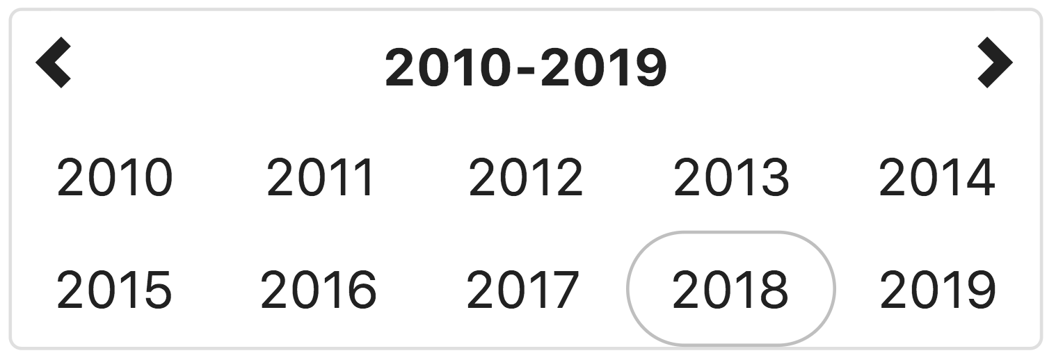
This view allows the user to select the year for the target date. If the year view is the minView, the date will be set to midnight on the first day of the year
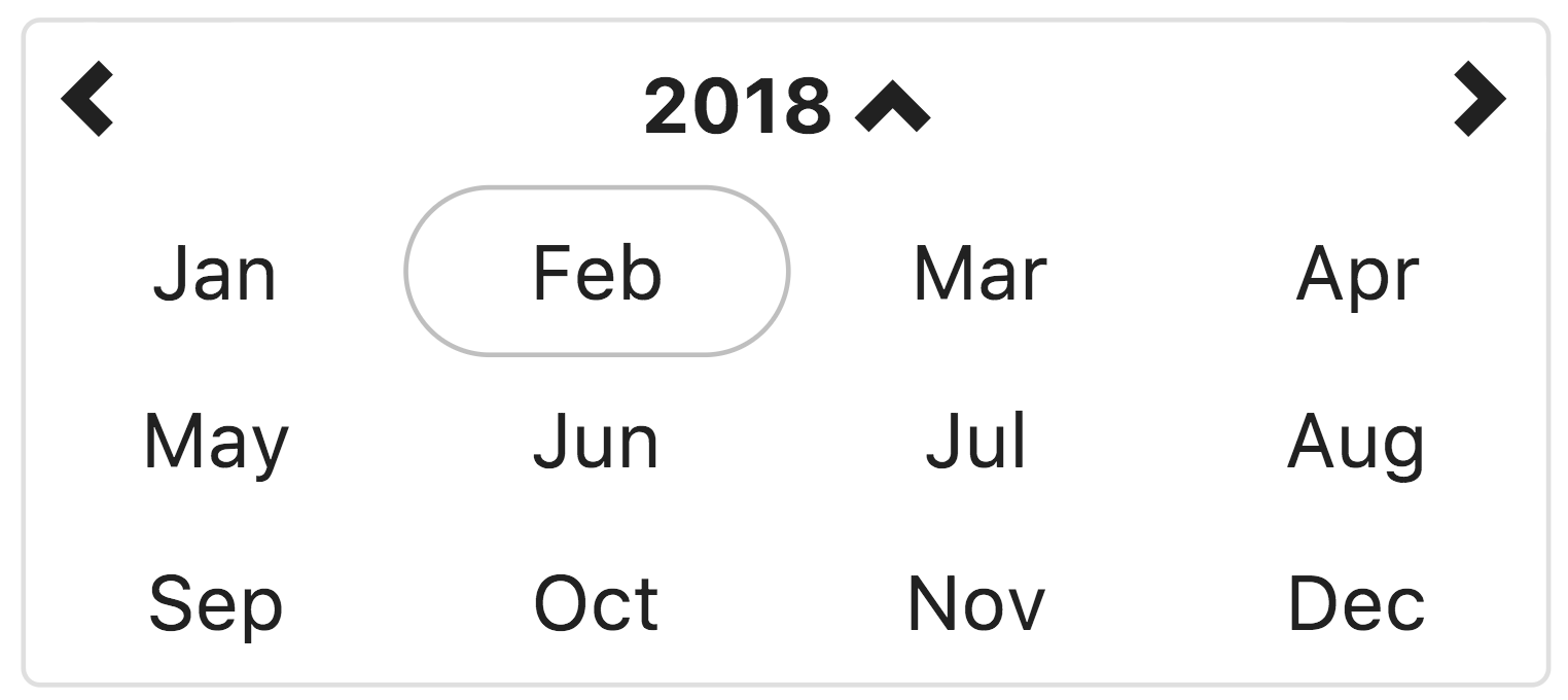
This view allows the user to select the month in the selected year. If the month view is the minView, the date will be set to midnight on the first day of the month.
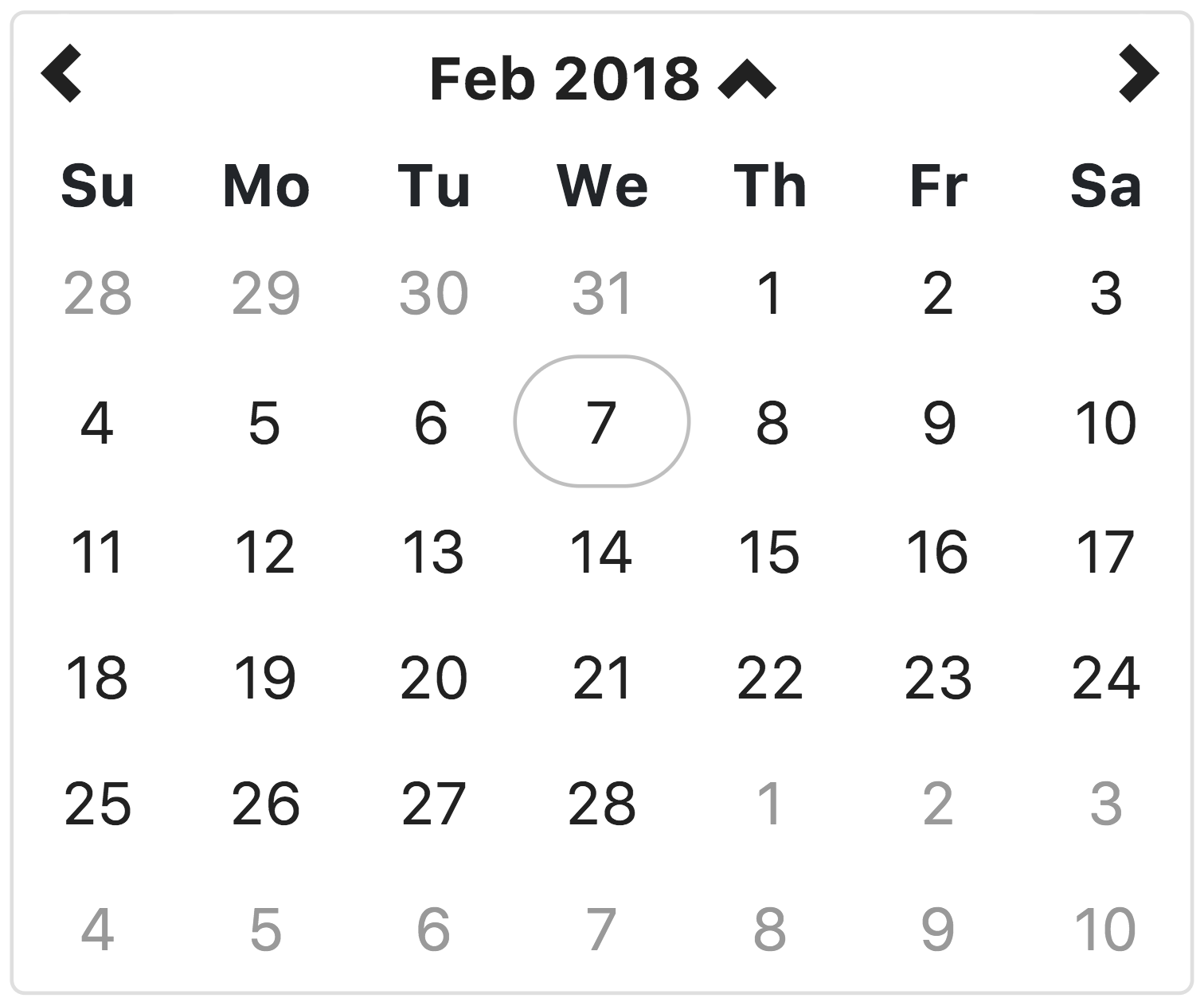
This view allows the user to select the the day of the month, in the selected month. If the day view is the minView, the date will be set to midnight on the day selected.
This view allows the user to select the hour of the day, on the selected day. If the hour view is the minView, the date will be set to the beginning of the hour on the day selected.
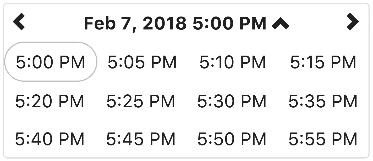
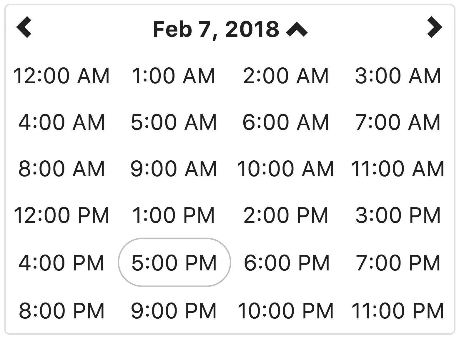
This view allows the user to select a specific time of day, in the selected hour.
By default, the time is displayed in 5 minute increments. The minuteStep property controls the increments of time displayed.
If the minute view is the minView, which is is by default, the date will be set to the beginning of the hour on the day selected.
##Contributing
angular-bootstrap-datetimepicker is released under the MIT license and is copyright 2015 Knight Rider Consulting, Inc.. Boiled down to smaller chunks, it can be described with the following conditions.
- Keep the license and copyright notice included in angular-bootstrap-datetimepicker's CSS and JavaScript files when you use them in your works
- Freely download and use angular-bootstrap-datetimepicker, in whole or in part, for personal, private, company internal, or commercial purposes
- Use angular-bootstrap-datetimepicker in packages or distributions that you create
- Modify the source code
- Grant a sublicense to modify and distribute angular-bootstrap-datetimepicker to third parties not included in the license
- Hold the authors and license owners liable for damages as angular-bootstrap-datetimepicker is provided without warranty
- Hold the creators or copyright holders of angular-bootstrap-datetimepicker liable
- Redistribute any piece of angular-bootstrap-datetimepicker without proper attribution
- Use any marks owned by Knight Rider Consulting, Inc. in any way that might state or imply that Knight Rider Consulting, Inc. endorses your distribution
- Use any marks owned by Knight Rider Consulting, Inc. in any way that might state or imply that you created the Knight Rider Consulting, Inc. software in question
- Include the source of angular-bootstrap-datetimepicker itself, or of any modifications you may have made to it, in any redistribution you may assemble that includes it
- Submit changes that you make to angular-bootstrap-datetimepicker back to the angular-bootstrap-datetimepicker project (though such feedback is encouraged)
The full angular-bootstrap-datetimepicker license is located in the project repository for more information.
Support this project and other work by Dale Lotts via gittip.


 React
React
 Typescript
 Django
 Laravel
 Facebook
 Microsoft
 Google
 Alibaba
 D3
D3
 Tencent