


| Name | Type | Default | Description |
|---|---|---|---|
| type | string | Required | custom:bar-card |
| entity | string | Required | Entity State |
| animation | object | none | Defines animation options. See Animation Options. |
| attribute | string | none | Displays a specific attribute instead of state value. |
| color | string | var(--custom-bar-card-color, var(--primary-color)) | Color of the bar. |
| columns | number | none | Defines the amount of bars to be displayed on a single row when multiple entities are defined. |
| complementary | boolean | false | Displays complementary value (max - state_value) instead state value. |
| decimal | number | none | The amount of decimals to be displayed for the value. |
| direction | string | right | Direction of the bar. right, up |
| entities | array | none | A list of entities. Accepts individual config options per defined entity. |
| entity_config | boolean | false | Sets the card to use the configured entity attributes as the card config. |
| entity_row | boolean | false | Removes the background card for use inside entities card. |
| height | string | 40px | Defines the height of the bar. |
| icon | string | icon | Defines the icon to be displayed. |
| limit_value | boolean | false | Limits value displayed to min and max value. |
| max | number | 100 | Defines maximum value of the bar. |
| min | number | 0 | Defines minimum value of the bar. |
| name | string | none | Defines custom entity name. |
| positions | object | none | Defines the positions of the card elements. See Positions Options. |
| severity | object | none | A list of severity values. See Severity Options. |
| tap_action | object | none | See home assistant documentation. |
| target | number | none | Defines and enables target marker value. |
| title | string | none | Adds title header to the card. |
| unit_of_measurement | string | attribute | Defines the unit of measurement to be displayed. |
| width | string | 100% | Defines the width of the bar. |
| Name | Type | Default | Description |
|---|---|---|---|
| from | number | Required | Defines from which value the color should be displayed. |
| to | number | Required | Defines to which value the color should be displayed. |
| color | string | Required | Defines the color to be displayed. |
| icon | string | none | Defines the icon to be displayed. |
| hide | boolean | false | Hides the bar if conditions are met. |
| Name | Type | Default | Description |
|---|---|---|---|
| state | string | off | Enables or disables animation. on, off |
| speed | number | 5 | Defines the speed of the bar animation in seconds. |
| Name | Type | Default | Description |
|---|---|---|---|
| icon | string | outside | inside, outside, off |
| indicator | string | outside | inside, outside, off |
| name | string | inside | inside, outside, off |
| minmax | string | off | inside, outside, off |
| value | string | inside | inside, outside, off |
| Name | Description |
|---|---|
| bar-card-color | Defines the default bar color. |
| bar-card-border-radius | Defines the default border radius of the bar. |
| bar-card-disabled-color | Defines the bar color when state is unavailable. |
See example. (requires card-mod)
| Name | Description |
|---|---|
| #states | HA states containing all rows. |
| bar-card-card | The root bar of each defined entity containing all elements. |
| bar-card-background | Contains bar and any elements outside of the bar. |
| bar-card-backgroundbar | The background of the bar. |
| bar-card-currentbar | The filled part of the bar. |
| bar-card-contentbar | Contains all elements inside of the bar. |
| ha-icon | Icon element. |
| bar-card-iconbar | Contains ha-icon. |
| bar-card-name | Name element. |
| bar-card-min | Min value element. |
| bar-card-divider | Min/Max divider element. |
| bar-card-max | Max value element. |
| bar-card-value | Value element. |
| bar-card-animationbar | Animated part of the bar. |
| bar-card-targetbar | Target bar element. |
| bar-card-markerbar | Target marker element. |
| bar-card-indicator | Indicator element. |
Prefered method of installation is Home Assistant Community Store.
It's required to load this card as module.
- url: /hacsfiles/bar-card/bar-card.js
  type: module
entity: sensor.example
title: Default
type: 'custom:bar-card'
entity: sensor.example
title: Severity
type: 'custom:bar-card'
severity:
  - color: Red
    from: 0
    to: 25
  - color: Orange
    from: 26
    to: 50
  - color: Green
    from: 51
    to: 100
entities:
  - sensor.example
  - entity: sensor.example
    positions:
      minmax: inside
    entity_row: true
    target: 50
    type: 'custom:bar-card'
  - entity: light.group_bedroom
    name: Example
title: Entity Row
type: entities
entities:
- sensor.example
- sensor.example
- sensor.example
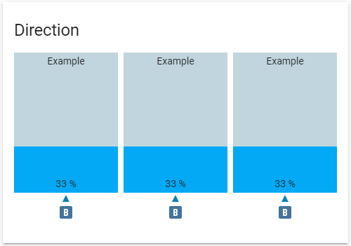
title: Direction
direction: up
height: 200px
stack: horizontal
type: 'custom:bar-card'2.0.0 Default Layout (requires card-mod)
entity: sensor.example
positions:
  icon: 'off'
  indicator: inside
  name: outside
type: 'custom:bar-card'
width: 70%
title: 2.0.0 Default Layout
style: |-
  bar-card-value {
    margin-right: auto;
    font-size: 13px;
    font-weight: bold;
    text-shadow: 1px 1px #0005;
  }
Custom CSS Layout (requires card-mod)
entities:
  - entity: sensor.example
positions:
  icon: 'off'
  indicator: 'off'
  minmax: inside
  title: inside
  value: inside
style: |-
  .contentbar-direction-right {
   flex-direction: column;
  }
  .min-direction-right {
    margin: 0px;
    margin-left: 4px;
    margin-right: auto;
    margin-bottom: -20px;
    bottom: 10px;
  }
    bar-card-value {
    margin: 0px;
  }
  bar-card-name {
    margin: 0px;
  }
  bar-card-max {
    margin: 0px;
    margin-left: auto;
    margin-top: -20px;
    top: 10px;
  }
  bar-card-divider {
    display: none;
  }
title: Custom CSS Layout
type: 'custom:bar-card'Inspired by Big Number Card by ciotlosm.

![dependabot[bot] avatar](https://avatars.githubusercontent.com/in/29110?v=4 "dependabot[bot]")


 React
React
 Typescript
 Django
 Laravel
 Facebook
 Microsoft
 Google
 Alibaba
 D3
D3
 Tencent